Burton’s Biscuits tasked a new design agency to redesign one of its most iconic brands. A prime objective for the artwork of this project was to champion consistency of brand colour – this was no small task with the design needing to be consistently reproducible across three print processes, four print sites and 4 packaging substrates. Burton’s required a production agency to create and manage the artwork approval process for thirty-four SKUs and lead discussions with the design agency and printers in creating a special ink formulation.
A key feature of the Jammie Dodgers redesign was the need to change the iconic ‘Jammie Dodger Red’. Leading this process by utilising technical experience and the management of both printers and ink suppliers, a master colour was created as a special ink formulation for each variable (print process and substrate). This colour management was implemented as part of rolling out the artworks for all the different size formats and flavour variants in the range.
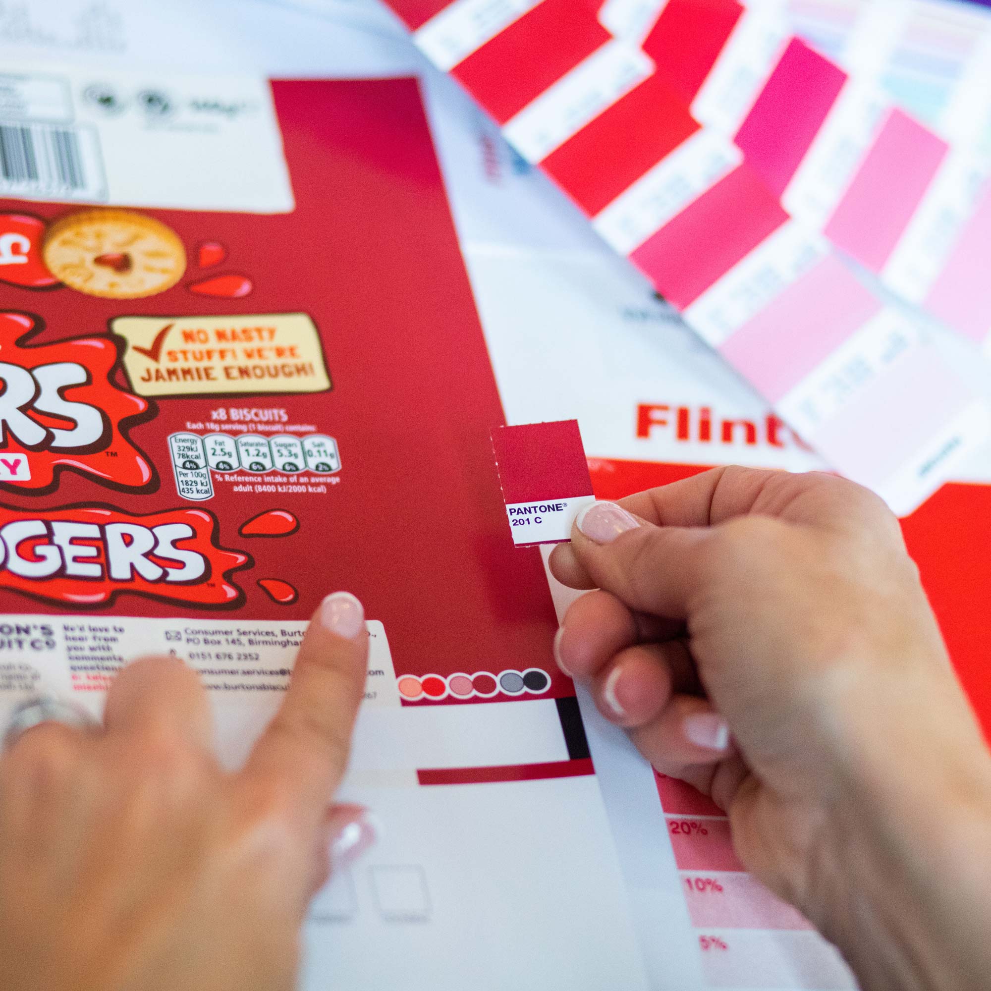
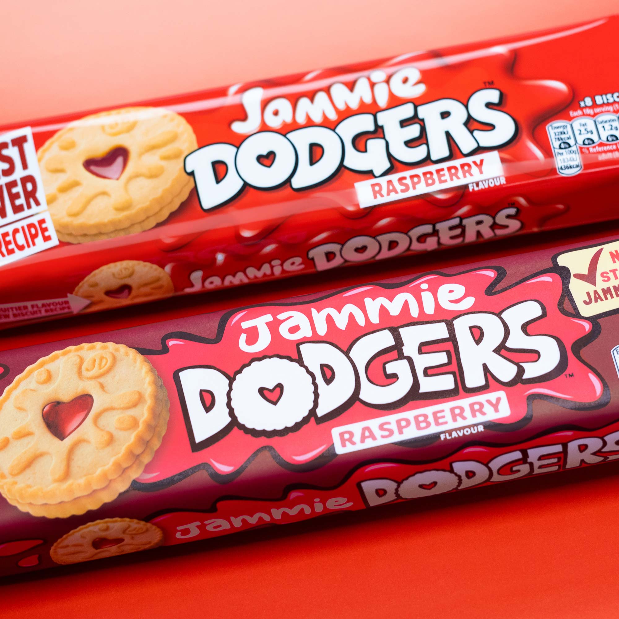
Certified Graphics’ connected expertise and technical brilliance created a successful printed result, delivering more brand colour consistency than the previous printed design. The ownership of the whole artwork production process ensured smooth cross-functional collaboration with the design agency, marketing department, ink suppliers and multiple printers – reducing the ‘headache’ and speeding up the process for the Burton’s Marketing team.
We can always trust Certified Graphics to collaborate with our design partners and printers in delivering expertise with a smooth and conscientious process – and a great end result.
Edward Yuen, Senior Brand Manager – Burton's Biscuits
